Silhouette or Detail: What Makes an Animated Character Read at a Glance?
Learn how animated character silhouette and detail work together, so you can shape a design that reads clearly at a glance and still feels distinctive.
A tiny animated figure crosses a pale doorway, and you recognise the character before the face turns towards you. That instant is the work of an animated character silhouette: the outer shape reaches the eye first, while interior detail adds identity and feeling after it. To design for both, begin with the action and viewing conditions, then decide what the outline must communicate and which details deserve to stay.
Start with the moment
Before drawing hair, seams or eye shapes, write down what the character needs to communicate in the scene. Is the figure sneaking, reaching, waiting, or offering something? A design that reads beautifully in a portrait may become vague when reduced to a small moving shape.
Choose a representative pose from the action, not just a neutral standing view. If the character’s main story beat is carrying a tray, for instance, the pose should show how the arms, torso and tray relate. That relationship may matter more than the character’s buttons.
Also consider where and how the audience will see the character: against a busy background, at a distance, or in a quick cut. These conditions tell you how much the design can ask of the viewer. If the character is often small in frame, let the large shapes do more of the identifying.
Build the outer shape
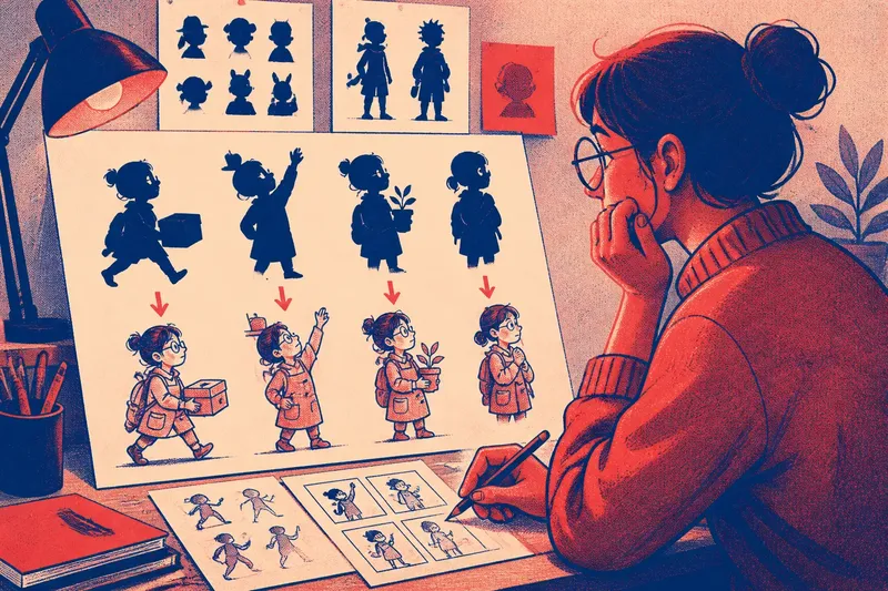
Make a solid black version of the character in the chosen pose. Use a simple brush in a drawing programme, or cut a rough shape from paper. The aim is not polished artwork; it is to see whether the body and its action remain legible without facial features, clothing marks or colour.
Look first at the broad masses: head, torso, arms, legs and any carried object. Can you tell where one limb ends and another begins? If a hand merges with the body, change the pose or create a small gap. A clean wedge of background between arm and waist can clarify the gesture more effectively than a carefully drawn sleeve.
Then check the character’s contour for a few distinctive landmarks. A broad collar, a bent antenna, a projecting fringe or a long scarf may give the outline a recognisable rhythm. Keep only features that remain useful in the poses the character actually makes; an ornament that disappears whenever the character turns may not help much.
Imagine a courier character whose defining action is handing over a parcel. In the first sketch, the forearm sits against the torso, and the parcel reads as a lump in front of the body. If you shift the elbow outward and tilt the parcel to expose its corners, the gesture becomes easier to read even before adding the courier’s cap or badge.
Test several poses
A silhouette is not a logo that must stay identical from every angle. It is a practical shape that needs to hold up across the movements that matter. Draw a small pose set: a front or three-quarter view, a side view, and the strongest action pose in the scene.
Fill each drawing with the same dark tone. Compare the head-to-body proportion, the space around the limbs, and the direction of the pose. If a character looks distinctive only while standing still, identify which feature vanishes in motion and decide whether it needs a clearer shape, a more reliable placement, or no special emphasis at all.
Try shrinking the sketches to the size they might occupy on a phone screen or a distant monitor. You do not need a particular scale; simply view them small enough that tiny marks stop being comfortable to inspect. The test reveals whether the character depends on details the audience is unlikely to see in the scene.
Where two characters appear together, compare their silhouettes side by side. Similar heights are not automatically a problem, but identical head shapes, posture and limb spacing can make a quick exchange harder to follow. Vary a major proportion or habitual stance if the scene needs the audience to distinguish them instantly.
Add interior detail
Once the pose reads in solid black, bring back the inside of the shape. Interior details can clarify material, role, personality and mood: a folded sleeve suggests a different surface from a smooth arm, while a few facial marks can make a neutral head feel curious or wary.
Give each mark a job. A sash might identify the character’s role; a set of heavy eyelids might support a tired expression; a stripe on a sleeve might help distinguish one arm in a complicated pose. If a line neither supports recognition nor contributes to the impression, it may be visual noise.
Keep the detail hierarchy deliberate. Large features should remain visible at the intended viewing size; small decorative marks can disappear without taking the character’s identity with them. In animation, a feature that is fiddly to redraw or maintain across poses may also draw attention to inconsistency instead of character.
Think of silhouette and detail as answering different questions. The outline says, “Who is moving, and what are they doing?” The interior says, “What kind of person might this be, and how should this moment feel?” One should not be asked to do all the other’s work.
Check the first read
Now compare a filled silhouette with the detailed drawing, at the size and against the kind of background the scene will use. Look away briefly, then glance back. Note the first thing you recognise: the action, the character’s identity, or a distracting patch of detail.
For a useful review, show the drawings to someone who has not heard your explanation. Ask what the figure appears to be doing and which feature they noticed first. Their answer is not a verdict on the design, but it can expose a gap between your intention and the visible evidence.
If the action is unclear, adjust the pose or negative space before adding marks. If the action reads but the character feels generic, try a distinctive proportion or a single strong interior feature. If the face is carrying the entire design, consider whether the head shape or posture can contribute more.
Say you are designing a shy botanist who reaches for a pot on a high shelf. In the first version, the bent arm blends into the body and a detailed leaf pattern on the coat draws the eye away from the reach. You could separate the elbow from the torso and simplify the coat pattern; the observable result should be a clearer reaching gesture, with the botanist’s round glasses and careful posture left to supply personality.
Keep what earns its place
Refine the design in the order the viewer encounters it: first the overall shape, then the action, then the defining interior features. Make a change, return to the small view, and see whether it improves the intended read without creating a new tangle. This is more useful than polishing every line in isolation.
Do not spend long perfecting tiny texture that vanishes at normal viewing size. That effort is better spent separating a hand from a prop or making the character’s posture more distinctive. Fine detail has a place when it matters close up, but it should not be mistaken for clarity.
Keep a clean silhouette drawing beside the finished design as a reference while making new poses. It helps you notice when a familiar outline has become crowded or when an important landmark has drifted. Treat it as a reminder of the design’s visual priorities, not a rule that forbids expressive changes.
Questions about character design?
Should every animated character have a unique silhouette?
Not necessarily. A cast can share a broad style or body plan, but the figures should remain easy to tell apart in the scenes where confusion would matter. Distinct posture, proportions, props or head shapes can provide that difference without making every outline unrelated.
Can costume detail rescue a weak silhouette?
It can help identify a character when the viewer is close enough to see it, but it is a poor substitute for a readable pose. If the costume marks disappear at small size, they cannot clarify a gesture that already merges into the body.
How much detail should a character have?
Keep enough to support the scene’s intended impression and recognition at its normal viewing size. The right amount depends on how close the character appears, how quickly the action passes, and whether the details remain clear through the movement.
What if the design works in a still but not in motion?
Check the poses where limbs cross the torso, objects cover the face, or the character turns away. A design can be clear in a portrait and still need small changes to its proportions, spacing or feature placement for moving scenes.
The most useful test is not whether every part of the drawing attracts attention, but whether the audience notices the right thing in the right order. A clear animated character silhouette establishes the action; carefully chosen detail gives that action a person to belong to. When both are doing their own jobs, a glance can carry more than the design has to explain.